Redefining neuronavigation. Anywhere.
A technology that was redefining "ready" in need of a brand that did the same
ZETA came to us at an inflection point. The technology was already doing something others couldn't: real-time cranial navigation without fixation, a workflow designed for speed, and a device that belongs at the bedside as much as in the operating room. They had hospital traction in the US, a clear expansion into Europe on the horizon, and the need to present credibly to two very different audiences, clinical partners who needed to trust the device, and investors who needed to believe in the company.
Their existing brand wasn't matching the ambition or the precision of what they were building. That gap was the brief.
_THE CHALLENGE
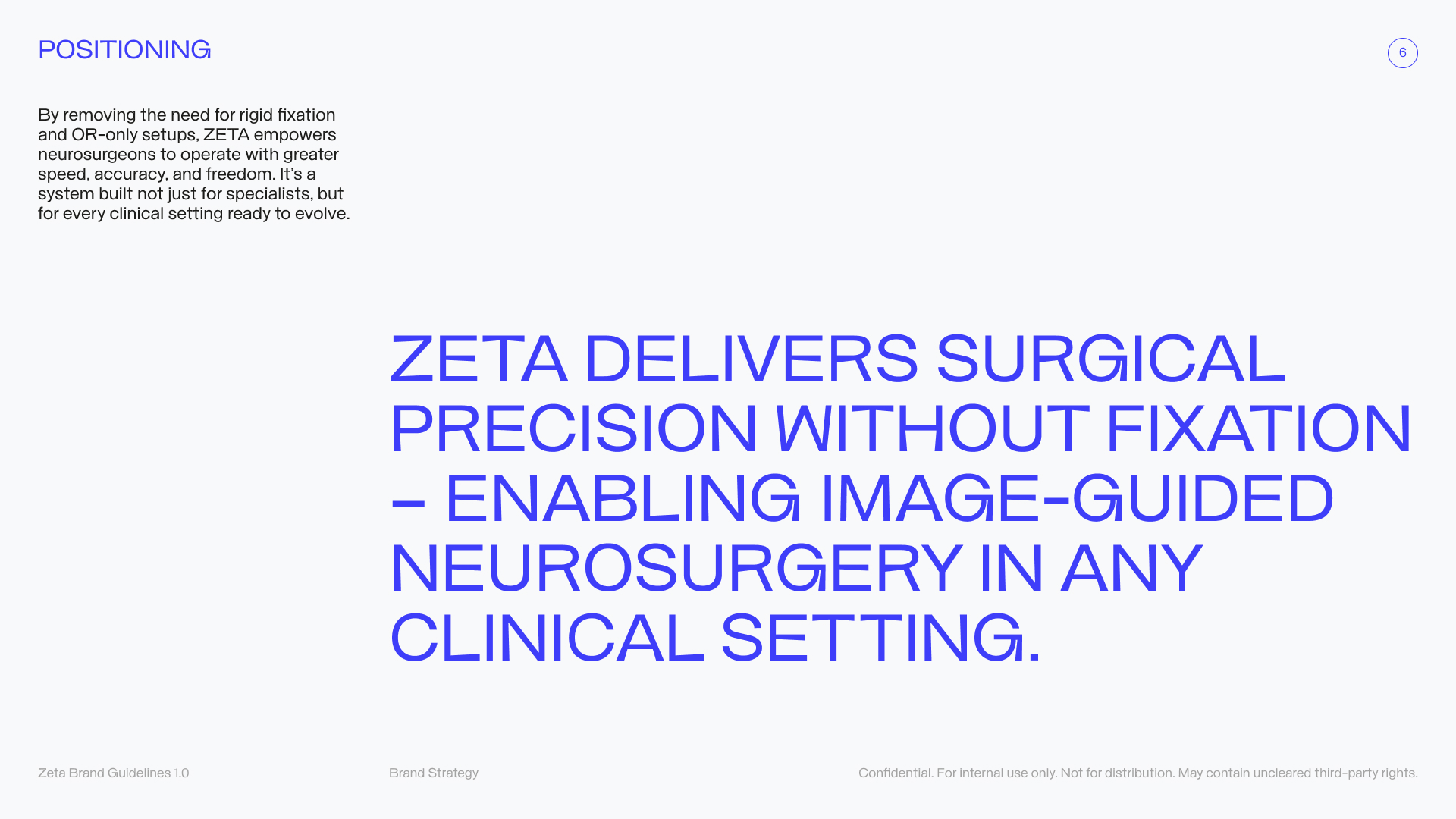
Clinical credibility and investor appeal, at the same time, with the same system
The hardest thing in medtech branding is that you're always speaking to two or more audiences with fundamentally different decision-making frameworks. A neurosurgeon for instance, evaluates on precision, safety, and workflow efficiency. An investor evaluates on market position, scalability, and competitive differentiation. Most brands choose one and underserve the others.
Our job was to build a visual language that could carry both, without compromise and without noise.
How do we make a surgeon take us seriously and make a VC want to invest; with the same brand?" That tension was the heart of the project.
_WHAT WE DID
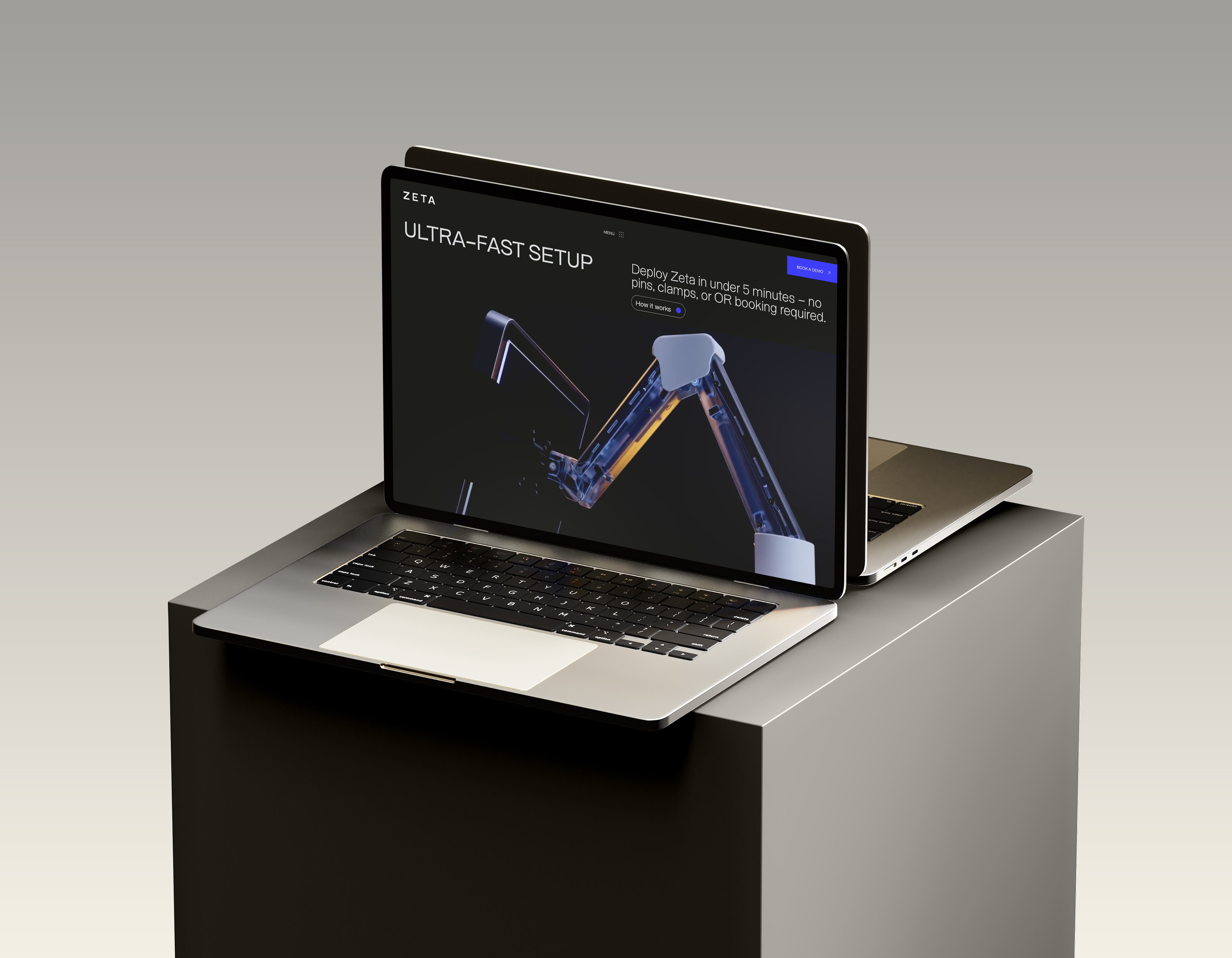
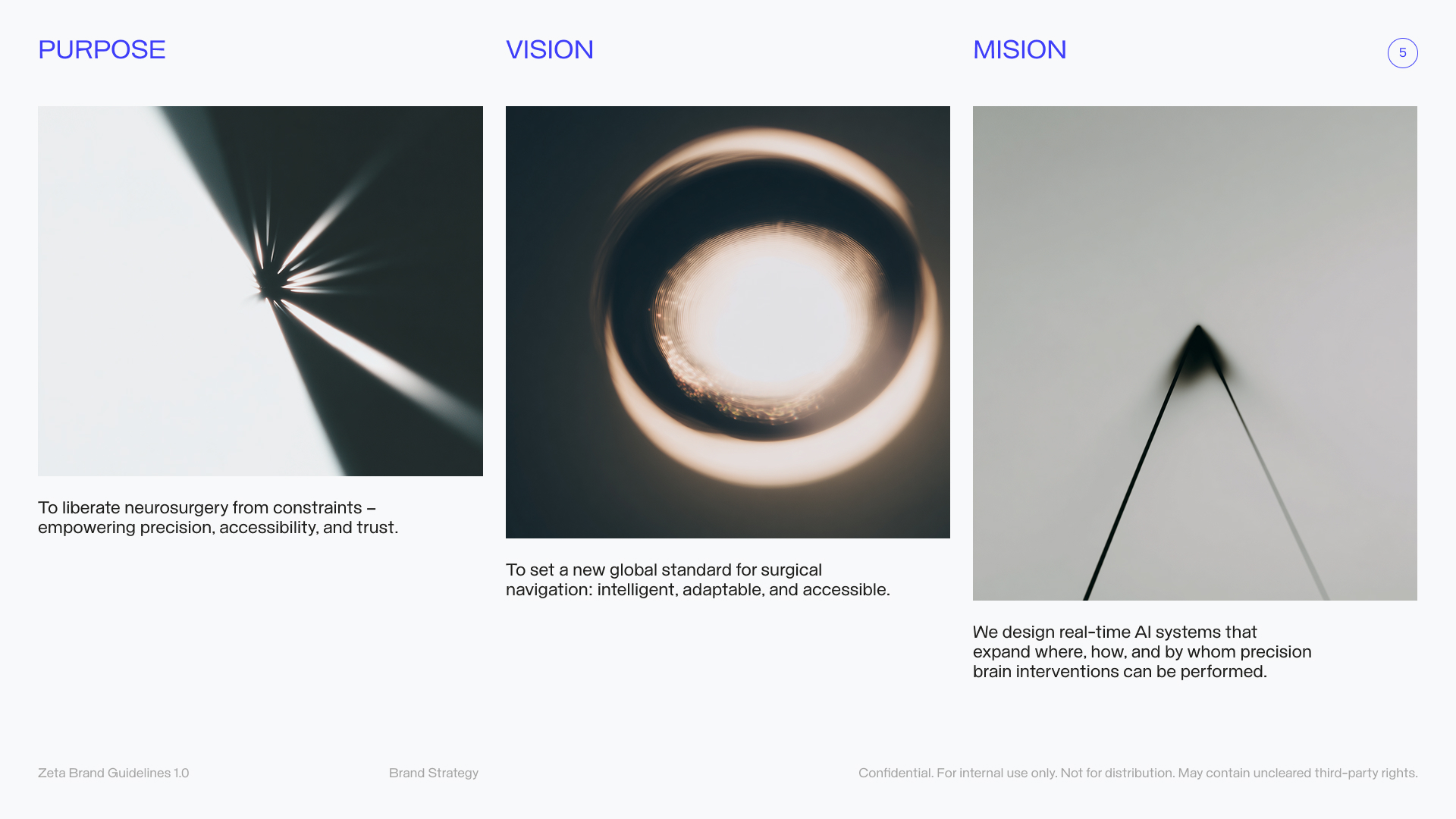
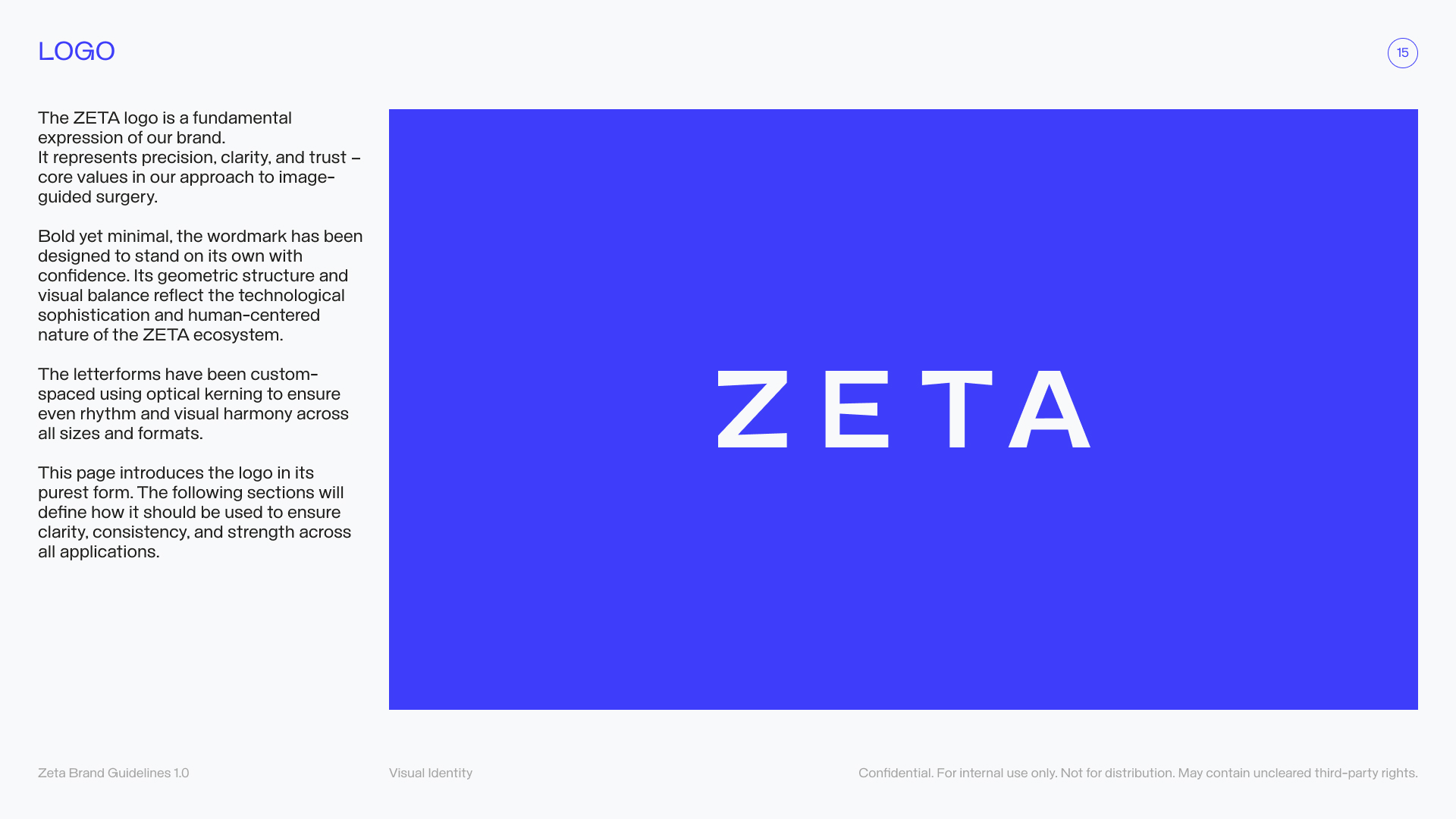
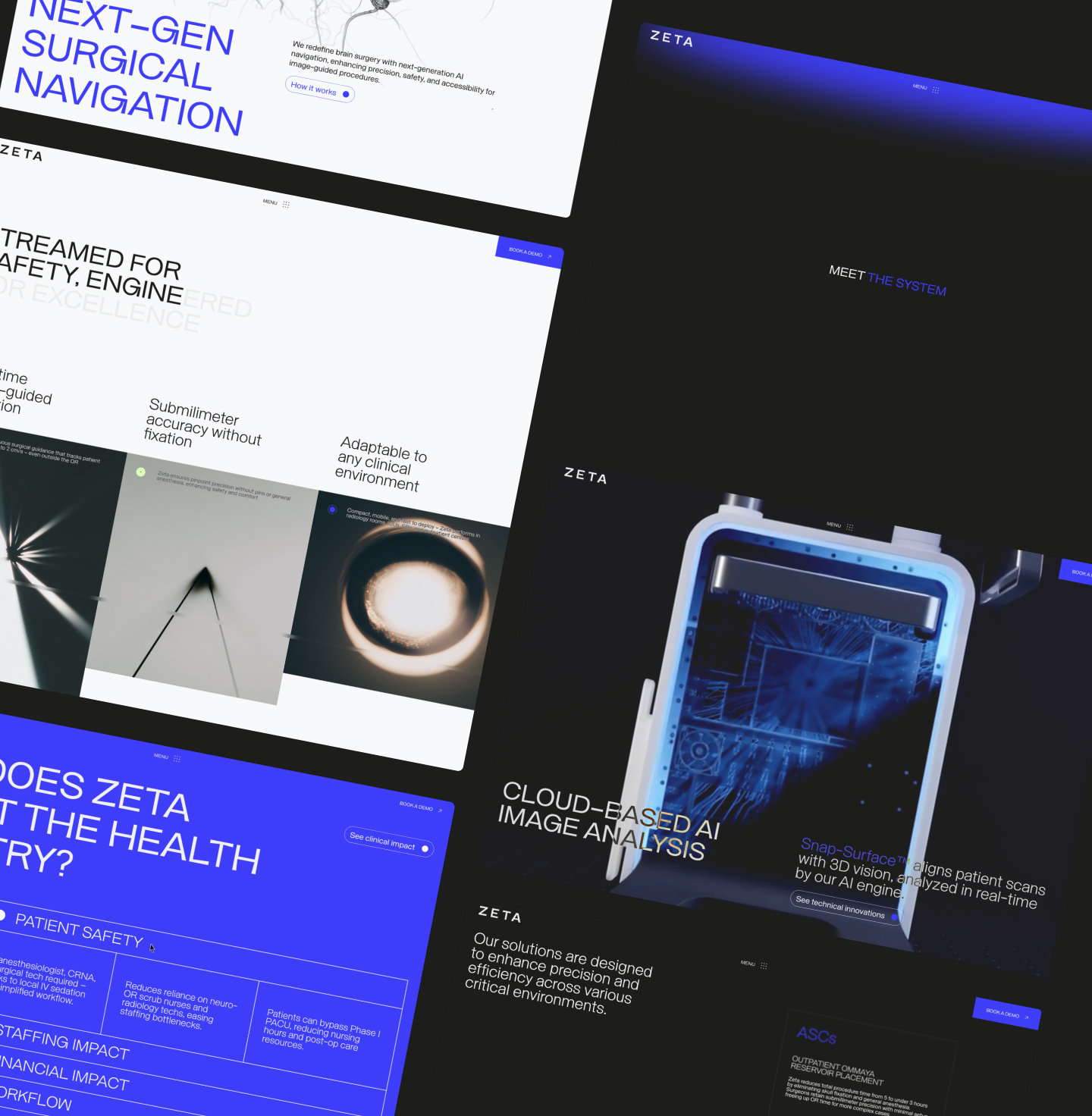
A brand system that behaves like the product.
We started by defining positioning and tone of voice, not as an abstract exercise, but as a practical decision about what the brand needed to communicate to whom, and in what order. Precision first. Confidence second. Warmth where it earned trust without sacrificing authority.
Then we designed the brand system to behave like the product: high-contrast, low-noise, decision-ready. That meant defining clear visual rules for precision (typography, spacing, hierarchy), safety and clarity (color use, UI, legibility on imaging), and consistency across touchpoints, so a neurosurgeon sees the same discipline in the UI as a committee sees in a value-analysis deck and a buyer sees in a procurement one-pager.
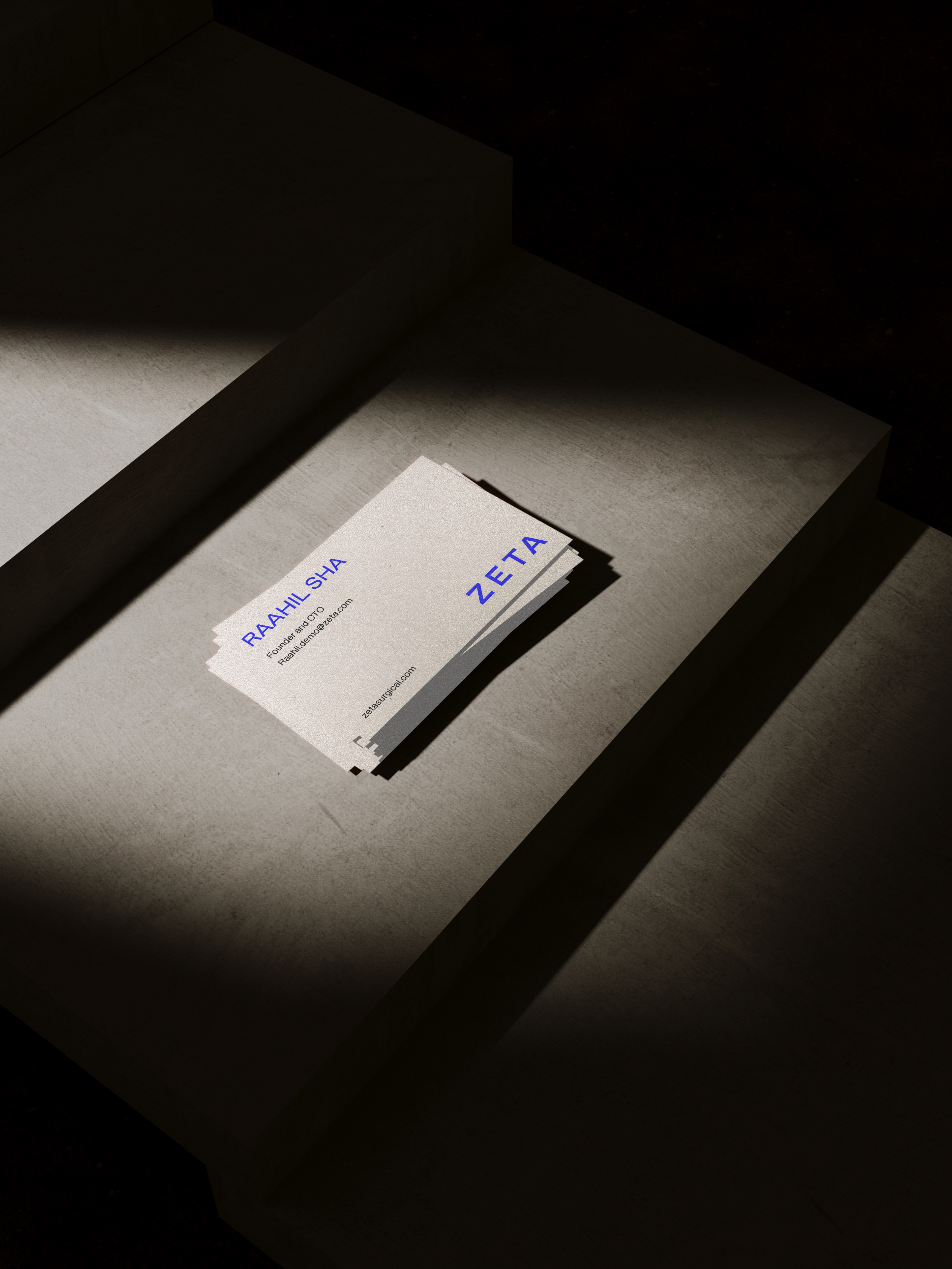
The website, hospital decks, procurement one-pagers, and go-to-market materials all follow the same logic. Consistency wasn't a design choice — it was a credibility strategy.
_THE RESULT
A brand that does the same work as the device
The outcome is a brand that supports every conversation ZETA needs to have, with the same clarity the device brings to the procedure. It reduces friction in clinical evaluation, strengthens the purchasing story at committee level, and positions ZETA in the market with the visual authority the expansion it requires.
A brand that earns trust fast, scales without breaking, and makes the right people take ZETA seriously, before a word is said.

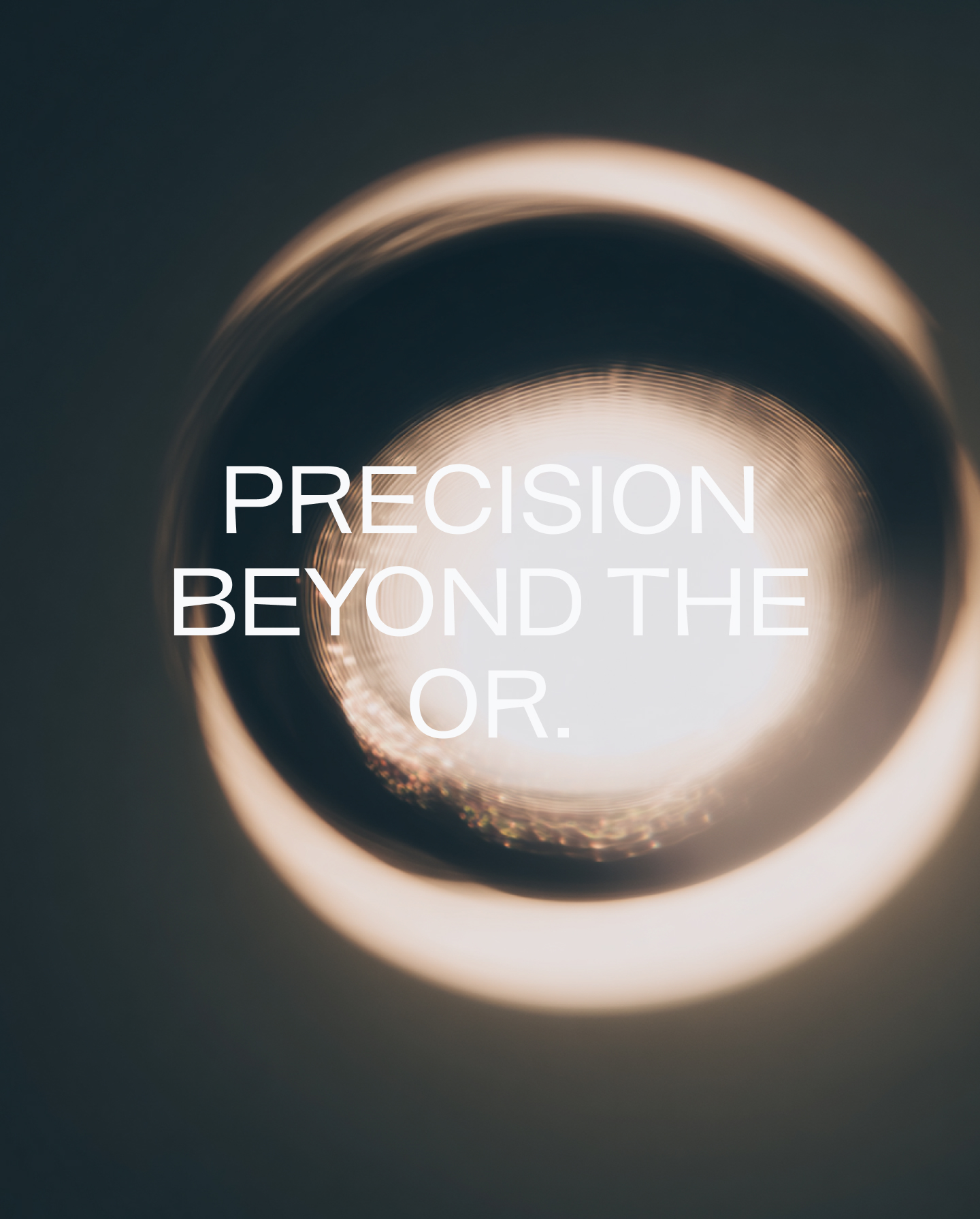
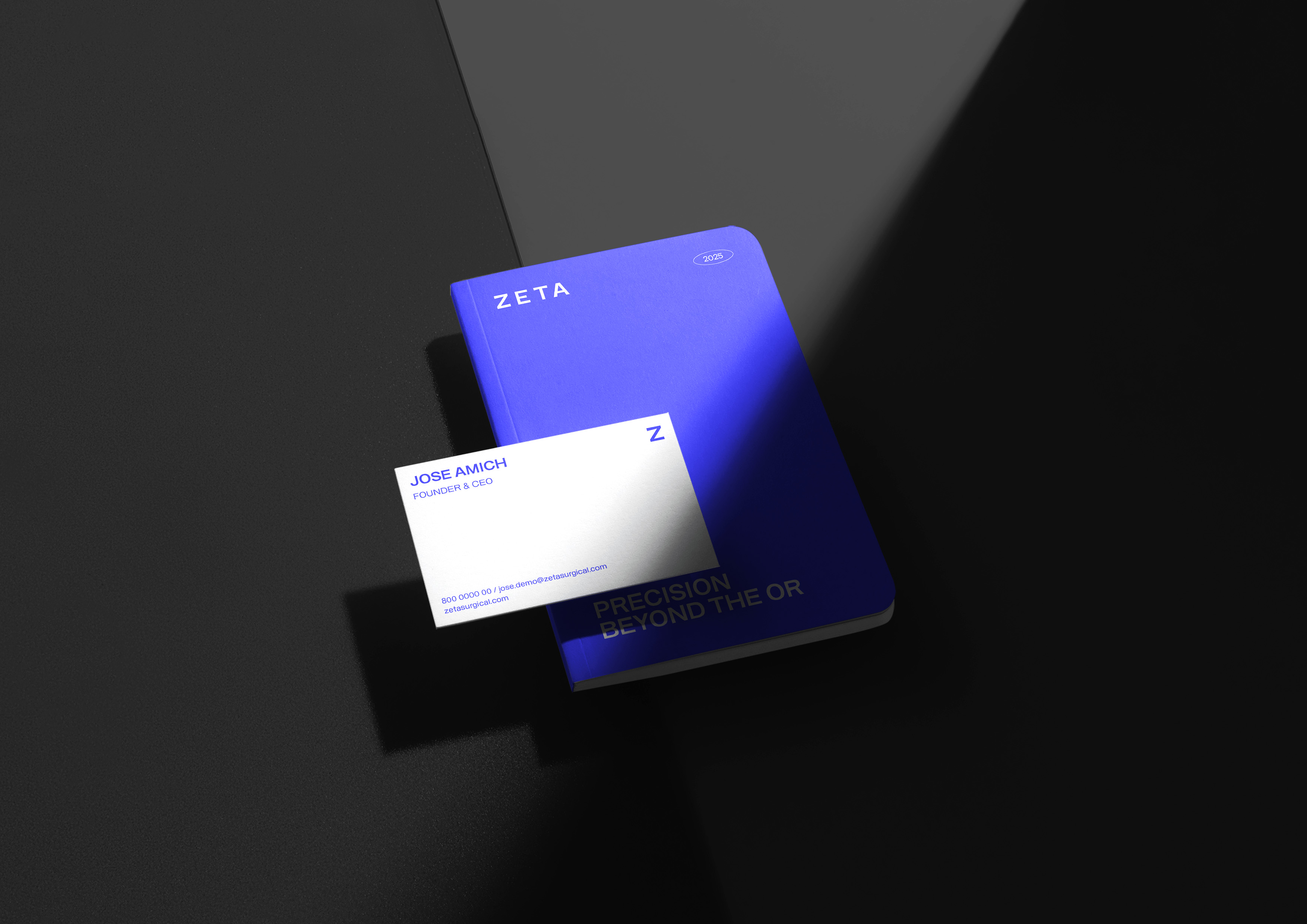
Precise. Scalable. Human.
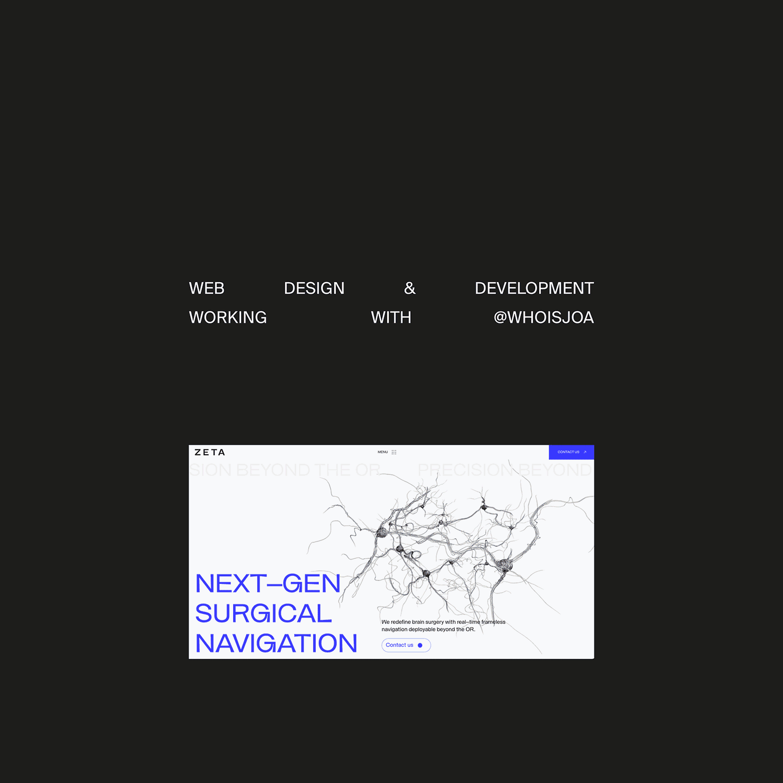
Web Developer: Who is Joa
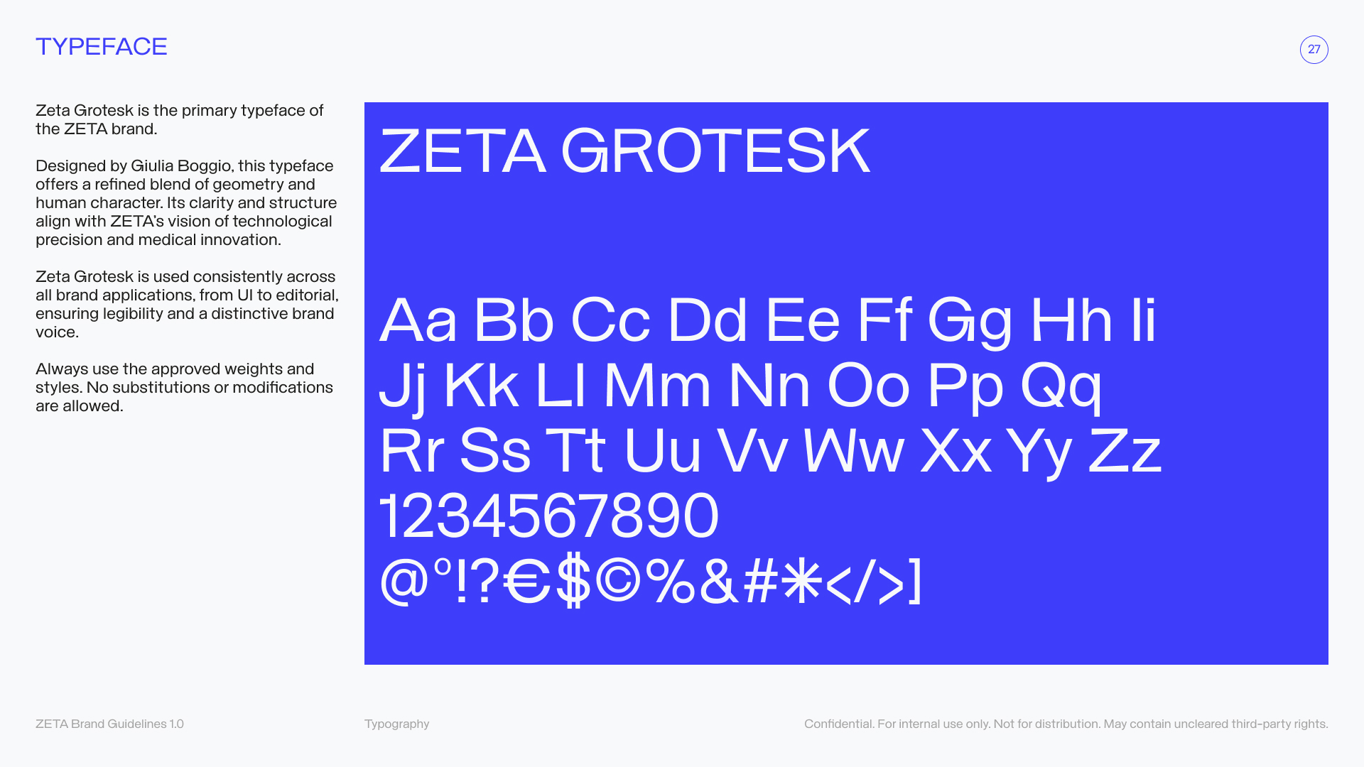
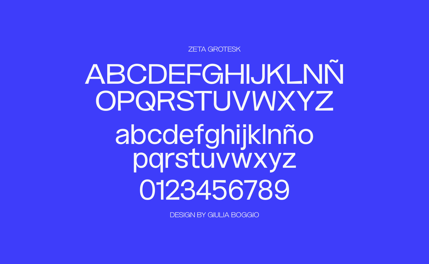
Typeface Designer: Guilia Boggio
A brand built to lead the future of neurosurgery.
Back to work